Glitched Hearts: A Postmortem
Introduction:
Amongst game jams, LowRezJam has always been one of my favourites. The relaxed optional themes combined with a harsh but incredibly cool limitation, a 64x64 pixels resolution, leads to all sorts of creative entries and demakes of every kind and flavor. Last year, I made a drilling game with rpg elements called Pocket Drillpunk. One of the biggest challenges was the UI, of course - and I ended up making a custom, multicolor pixel font to improve readability.
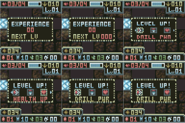
Fast forward and I've decided again to make something with heavy RPG elements - and to rebuild the whole pixel font idea from scratch to allow for some cool effects, such as fading, changing colors, and jumping text. The first two days of development were practically font tests.
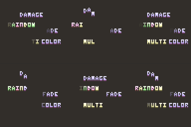
I really loved the outcome, though.
The second challenge, and maybe the biggest of all, is scope creep. I've been noticing on the past few jams that I tend to get super carried away scope-wise, and it usually results into heavy crunch sessions and headaches. However, it's something I realized is a huge part of why I love game dev.
It's not only the intricate relations between objects, scenes, gameplay, but also how they're molded into a specific shape in an attempt to make the players feel or act a certain way. I do try to contain it, and I've been practicing the art of cutting content/features so I can deliver something meaningful that feels like a game, not just a tech demo.
I made Glitched Hearts for this game jam by combining three of the optional themes. Cooperation, Glitch in the Matrix, and Gotta Catch 'em All. Before telling you what went well and what went sideways, an introduction first:
The Game
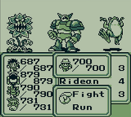
Glitched Hearts was born out of an inspiration I had from a game I used to love: The Final Fantasy Legend, which, curiously, isn't originally a Final Fantasy, but was actually the first SaGa game. It got the FF name because of the western release, because they figured it would improve sales. In that game, you could use items from foes to transform your characters into other classes and even mutants/monsters, allowing you to build your party in a very dynamic way.
Another reasoning I had for making this game is the fact that I've always wanted to make an RPG-esque gauntlet game, where you fight bosses after bosses while evolving your characters and all. A "mini" RPG experience with high replayability and customization. It was born out of an idea for a larger project that I never actually tried to make - A roguelite RPG game with random characters, stories, twists and classes, meant to be "little tastes" of full-fledged RPG games but in a compact, randomized manner.
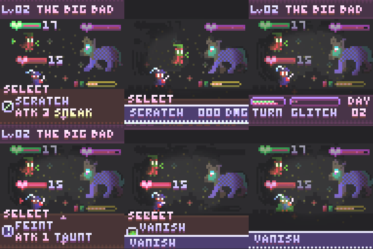
Glitched Hearts, in the end, became a gauntlet FF-esque RPG in which you can change your class based on eating the remains of a killed monster with either of your characters. There are 3 challenges, with a total of 6 possible monsters to fight, and 8 total classes, each with their own stats, level progression, and skills.
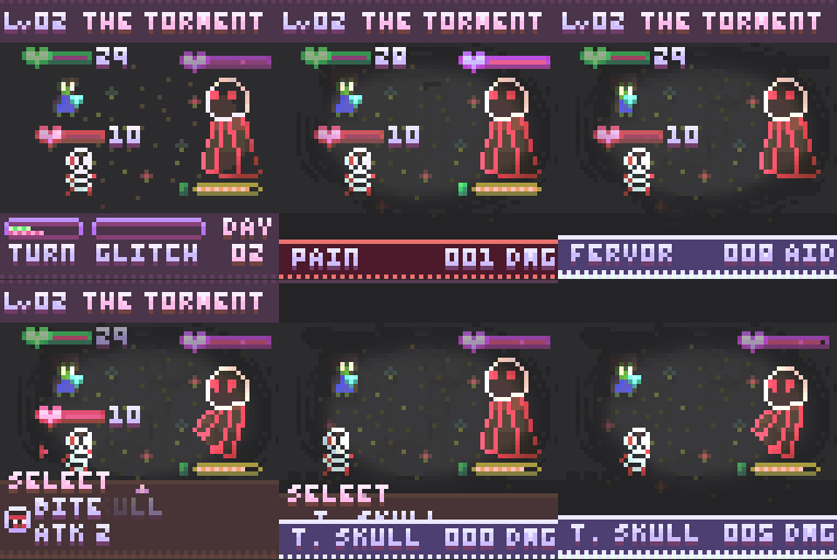
So, here's what went wrong and what went well with the whole development process:
Wrong: Too much Framework, not so much Experience
This is something harsh, but I think I have the wrong mentality for Jam Games. I mean, it's not inherently wrong - since the goal of a game jam for me is to improve, not to win - However, I find myself worrying too much about how systems will interact with each other, and not exactly on the playing experience per se.
I usually end up with a game that could be further improved post-jam, and with a code that I'm generally quite proud with, but that misses the mark regarding "How are players going to feel when they first experience this game?". Things like, "should this game have an intro cutscene", or "how do I better tutorialize the gameplay", are usually ignored while I try to make the systems fit inside an imaginary design box I created out of my mind.
This results into something curious, and sometimes tragic: I think I make excelent frameworks, factories if you will, but not always excelent games. Not to say that Glitched Hearts came out bad - on the contrary, I personally love it. But it is a game made with too much worries about the "completeness of a vision" rather than a focus on experience and first impressions.

Right: Battle System
I know I'm guilty of having borrowed so much from the series I love, but I do concede that helped me a lot during the whole development process. The Active Time Battle, from FF, felt just right inside Glitched Hearts. I wanted a game that didn't feel like a slow crawl, but at the same time I wanted every enemy to feel like a boss (or mini-boss, for that matter).
The speed of the active time gauge coupled with how it interacted with different classes and enemies is something that I'm really happy with. I spent time adjusting values so that the glitch mechanic could be thoroughly seen - and in some cases, even obligatory to win, because that was important to make the player feel like they're fighting a tough foe.
Implementing it was relatively simple as well. I have a BattleManager class which is a Finite State Machine which control what's currently happening on the game. Turn Gauges would then signal to the battle manager whenever they got filled. By leaving them highly customizable, I was able to include some cool stuff like focus/channel and skills that delay or break the enemy's turn gauge.
Also, because of how the system works, I could easily create add-ons such as counters, auto-healing, taunts, and etc - it is super flexible. I wanted to implement regen as well but time was catching up on me so I had to cut that.
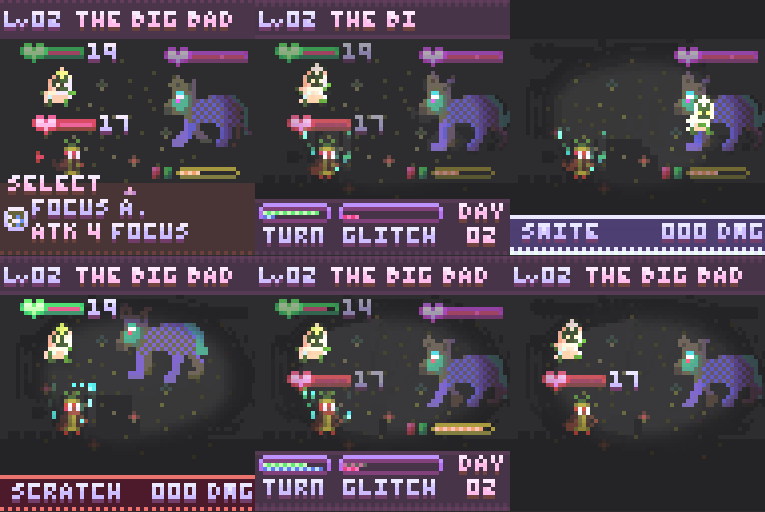
Wrong: Enemy Visuals
At first, I wanted the enemies to be menacing, threatening, and look cool. However, since I spent so much time on the systems and the character classes, I didn't have enough time to work on the enemies. I noticed that it was really difficult to convey what I was trying to do with the experience I had, and because of that some enemies look incredibly silly, such as "The Big Bad". It was supposed to be a scary glowing wolf with moon-like powers, but it kinda looks like a fluffy dog.
This comes down to time management. I could've worked on the enemies during the week when I couldn't do the heavy programming as I was tired from the day job. I think for this kind of game, having better enemy animations would definitely help me to portray the boss rush style gameplay.
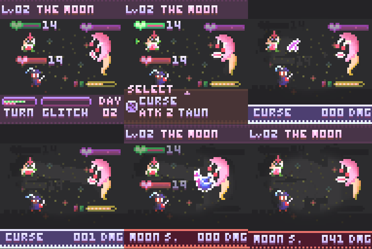
Like, what even is the Moon?
Which takes us to another wrongdoing:
Wrong: Balancing
The gif above is slightly manipulated, but it's not far from the experience I'm seeing of players fighting against the last boss. With 8 classes with different stat curves, and skills with different combinations, it was exceedingly hard to test all possible outcomes. The game is almost 100% deterministic, which helps, but even so, testing everything after changing values was pure hell.
In this case, I think there could be a simulator in which I would input the actions and test the battle outcomes in a quick way. This would likely take some time to develop though, so I'm actually not sure if it would help or harm the development cycle.
Another option would be to simply make the game easier, that would however break my initial intention of having each fight feel like a boss fight. In the end - there are some classes that can take on the moon easily, while others will suffer and some may even warrant an impossibility to win.
Right: Glitch Skills
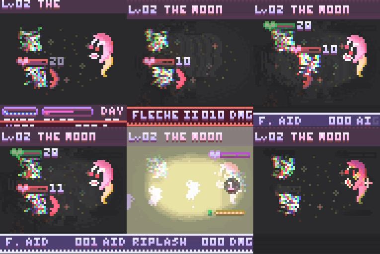
I almost took these out of the game, simply because they required dev time and attention to details to at least make them feel like powerful representations of the character's class. However, I'm very glad I didn't, because it makes you hope to turn around an otherwise lost battle, and that can be an awesome feeling when it works. The way glitch skills work is similar to Limit Breaks: They are overpowered skills that can only be used after the glitch bar is filled.

Right: Screen Transitions, and Easing
One small thing that helped a lot with the flow of the game were the cute screen transitions between each and every scene. It's a pretty basic thing that has a very powerful result: it lessens the burden of loading new scenes. The game never seems to "freeze" out of nowhere, which makes it seem more polished.
Not only that, but the easing of UI elements and even of character movement when performing skills also helped making it solid. Bouncing panels, typewriter effects, fade in/out, were relatively small things that generated a nice boost in quality, in my opinion.

Right: I made what I wanted to make
And yes, this may sound cheesy or naive, it's just that I really enjoyed every single moment, even the crunch hours. Now, I'm not incentivizing crunch, I think I could've done better with proper time management, especially going solo - but I feel like I'm slowly gravitating towards the kind of games I want to make.
Depth attracts me, as in creating complex/intricate systems that allow for customization and/or player independence, and I've noticed that each and every jam game I make contains a little bit of that in one way or another, with some exceptions which, coincidence or not, are the games I like less.
I love procedurally generated stuff (like in Pocket DrillPunk), and unusual game systems (like Uncadaveric or Faecula). I love RPGs (like this one or even my attempt at an Action RPG for Ludum Dare, "All About that Buzz"). I like the randomization and novelty that comes from Roguelites, and I love the heavy customization found in CRPGs and Strategy Games.
It's niche, that's a given. However, I feel like that seems to be my path as a game dev, the one that tingles the right spots in my brain. It makes me happy.
Anyways, I hope you liked reading this Postmortem!
Till the next jam!
Leave a comment
Log in with itch.io to leave a comment.